
One of the favorite memes of the Left is Income Inequality. They tell us that over the recent years the wealthy, the top 10%, have seen their salaries increase by a greater margin than the poor, the bottom 10%. But is that true?
I heard an NPR story the other day that went to the Bureau of Labor Statistics (BLS) data to answer that question and here is what they found.
“So, for example, this morning I searched BLS, OES, bricklayers. And I learned that there are 50,000 some-odd bricklayers and blocklayers, which I didn’t even know is a profession, and that high-paid bricklayers and blocklayers make four times as much as the low-paid ones do. It’s about 80,000 to 20,000 or so.”
“And when I go back in time using the BLS website, I see that 10 years ago the ratio was closer to 3-to-1. So the ratio between the highest paid and the lowest paid has been growing steadily. I saw the same thing with actuaries, with embalmers, people who embalm bodies at funeral homes. I saw it with dental surgeons, with low-paid dental surgeons making far less than high-paid ones. I saw it particularly strikingly with journalists. And throughout, I saw the same trend. The top 10 percent make roughly four times as much as the bottom 10 percent.”
I decided to verify the work by NPR and used the following two websites to get income data from 2012 and compare it to 2001. The 2012 site is here and the 2002 site is here (check my work and do this yourself, it’s fun!).
The BLS data publishes average wages for 5 different percentiles (10, 25, 50, 75 and 90) and I calculated the percent change for each of these percentile groups (2012 vs. 2002) and if there is a true income inequality then the percent change in the higher incomes will be more than the percent change in the lower incomes. Simple math, right?
Here is a table and chart showing the comparison of wages for Brick and Block Masons (2012 vs. 2002) that was referenced in the NPR story.


This NPR report was totally wrong! The ratio of wages for the 90%tile compared to the wages for the 10%tile was 2.65 in 2002 and 2.69 in 2012 – hardly any change! While it’s true that the wage increase for those in the middle didn’t keep pace with those in the upper and lower ends, you can’t claim that the wealthy had more of an increase than the poor when looking at this Brick and Block Mason data.
That got me to wondering about other professions so here is the data from others that I chose at random. I’ll just report the findings graphically to save space on here but you can look at the detailed tables as well as the BLS job code listed in this spreadsheet so you can verify my findings on the BLS website.
Let’s first look at a profession that is near and dear to my heart – Electrical Engineering.
 Sure enough, this data show that there was an income inequality between the higher paid EE’s and lower paid EE’s during this 10 year period. See the black line that shows the percent change in wages for each of the percentile groups and the slope upwards indicates that those at the upper wage range saw bigger increases than those in the lower ranges during the time period 2002 to 2012.
There were other professions that followed this same pattern:


Then there were others that showed equal wage growth between all percentile groups or at least between the bottom 10%tile and the top 90%tile.


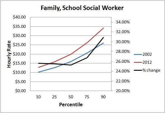
 I found the data for Elementary and Secondary School Teachers very interesting. Their data would totally blow the income inequality meme out of the water because the lower wage earners saw larger increases than the higher paid teachers.


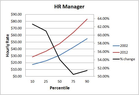
And this one really floored me. It appears the profession to be in during the past 10 years was HR Management. Like the teachers, lower wage HR managers saw a much bigger increase than their colleagues at the top. Also, while the other professions I spot checked saw, on average, wage increases of around 35%, HR managers experienced twice that increase over the past 10 years.
 So what did I learn?
Granted this is not a comprehensive look at all professions in the massive BLS data but I’ve seen enough to 1) discredit the NPR story and 2) cast serious doubt that we truly have a comprehensive income inequality problem in the US.

Love it when you anazlyze! Showing this to my husband, the HR director who listens to NPR!
Oh yeah? WELL! In spite of your graphs here that clearly show we’re wrong in these cases, we STILL know there’s income inequality sneaking around out there somewhere!
Yours truly,
NPR
The only way the NPR story could even hold water is if you start extrapolating and re-interpreting data from a pre-defined set or the math is beyond what they claim they saw/did.
Things like assuming that the lowest tier isn’t working 40 hours a week, or that they’ve managed to come out that the basic brick-layer isn’t making near the average. Or maybe the top end is working over 40 hours a week.
Sad state of affairs when you have to re-interpret data such as they’ve done just to make some major and whimsical claim when anyone with more than a few brain cells and 30 minutes (ie anyone NOT on the left) can look up readily available data and find the discrepancies themselves, such as you have.
What’s really amusing is that the liberal left prides themselves for being “more educated” than the right, but they would just as easily take a “trusted” and “impartial” news source such as NPR at face value….
In the figure , the solid line shows that average inequality has been increasing over the past decade, with a peak during the recession in the early part of the 2000s. 7 Comparing income inequality for the group of 24 states plus the District of Columbia that adopted predatory lending laws with the group of 26 states that did not, an interesting finding emerges: The states that adopted predatory lending laws experienced a higher degree of income inequality over the past 10 years, while the states that did not adopt predatory lending laws averaged lower income inequality over the past decade.
One important factor in the creation of inequality is variation in individuals’ access to education. Education, especially in an area where there is a high demand for workers, creates high wages for those with this education however, increases in education first increase and then decrease growth as well as income inequality. As a result, those who are unable to afford an education, or choose not to pursue optional education, generally receive much lower wages. The justification for this is that a lack of education leads directly to lower incomes, and thus lower aggregate savings and investment. In particular, the increase in family income and wealth inequality leads to greater dispersion of educational attainment, primarily because those at the bottom of the educational distribution have fallen further below the average level of education. Conversely, education raises incomes and promotes growth because it helps to unleash the productive potential of the poor.