
Let’s play a game to see if you can distinguish between temperature graphs from different time periods.
The following two graphs plot the average annual temperatures for the Contiguous US during two different 22 year time periods. One of the graphs shows the years 1914 to 1935 and the other shows the years 1991 to 2012. Can you correctly identify the time periods based purely on the temperature increases? I have blacked out the years and y-axis values so have a look and take a guess before scrolling down for the answer.
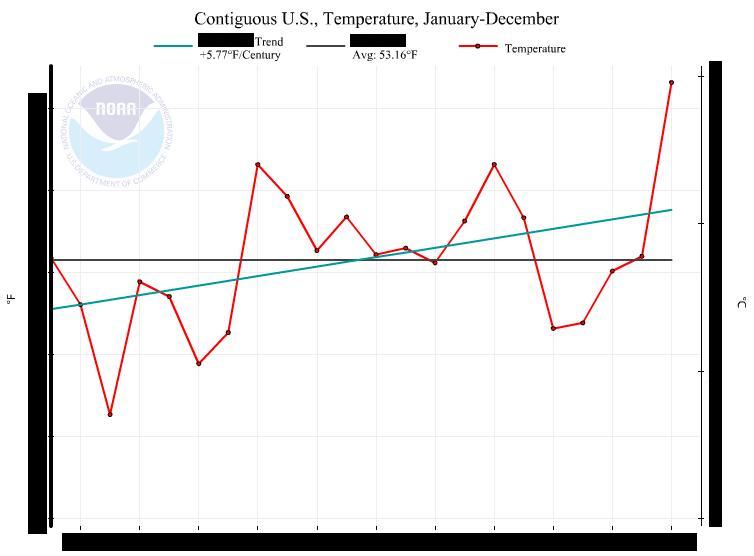
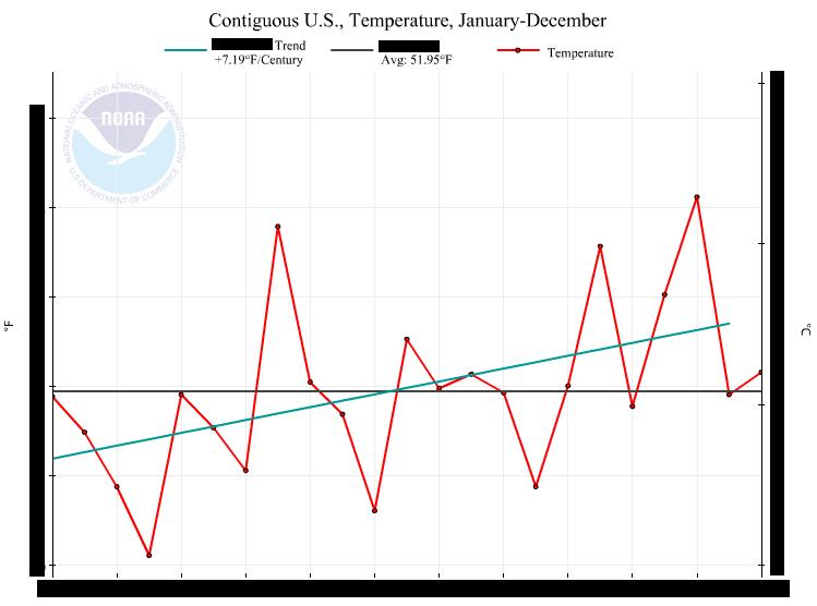
It’s hard to tell, isn’t it? We’ve been told that there is unprecedented warming in the last couple of decades but these graphs have similar slopes so it’s difficult to make that claim.
And now for the answer….
.
.
.
.
.
.
.
.
.
.
.
Maybe some jeopardy music is in order?
.
.
.
.
.
.
.
The first graph is from 1991 to 2012 and the second graph is from 1914 to 1935.
Our recent warming has a trend of 5.77°F per century but the warming we saw in the early 20th century occurred at a much steeper rate 7.19°F per century. “Unprecedented” indeed.
It makes sense that “Big Oil” would be spewing CO2 into the atmosphere carte blanche during the Republican administrations of Harding, Coolidge and Hoover. And silly ole me, I didn’t even know we had SUV’s during the early 20th century.
NOTE – These two graphs were generated from the National Oceanic and Atmospheric Administration (NOAA) site and the link can be found here.

PGH: “I’ll take ‘junk science’ for $1,000, Cosmo….”
Cosmo: “All right! Junk science for $1,000, PGH….and THIS is for the win! The answer is: this group misrepresents info and data, makes up bogus ‘hockey stick’ graphs, and claims we’ll all be living on floatation devices after all of the earth’s ice melts….take your time…..this IS for the win!”
(Music……….)
PGH: “Who is the AGW cult?”
Cosmo: “CORRECT!!!!”
I have no doubt that there is a change in the climate that we are going through. However, I dispute that it is man mad or that any effort man makes can change what nature has put into motion. For example, take the beginning of the planet where, instead of the continents as we now know them, the earth consisted of one supercontinent called the Pangaea. The Pangaea divided as a result of tectonic plate movements along with earthquakes and as the various land masses divided, that motion and relocation caused a number of things to change in the environment, including sea level heights and temperature changes.
Current theory in some circles believes that this motion is ongoing and that the land masses are pulling back together, again affecting various climate markers.
The tilt of the earth’s axis also has dramatic effects on global temperatures, shifts in its magnetic fields as well as gravitational changes from other celestial bodies.
Volcanic activity also affects global temperatures.
The above are just a few factors that have a bearing on the weather and climate change we are and always have been facing on earth. No amount of change brought about by humans can alter or stop these systems from creating change and no amount of money spent will suffice to counter the changes brought about by such natural phenomena.
The following link connects to an article I put up a while back and it includes a temperature map as well as links to other sites that extend from 2500 years B.C. to the present. Check it out: http://billericapolitics.org/2013/06/05/global-warming-theory-has-failed-all-tests-so-alarmists-return-to-the-97-consensus-hoax-watts-up-with-that/