
I recently showed how there has been no warming of the global temperatures over the past 15 years and I did that using the temperature data sets from UAH and HADCRUT. In case you were thinking I was cherry picking my datasets, I’ll use the interactive Goddard Institute of Space Studies (GISS) data tools to also show there has also been a halt to the calamitous global warming climate change predictions of the AGW cult.
I will give the GISS site props for providing web based tools to compare global temperature trends for different time periods and to grad the actual individual temperature station data and graph them with the click of a mouse. They did a great job here and with just a little reading on their website to figure out how to use the tools, in no time you can be generating graphs like those seen in this post.
I’ll be using the temperature trend maps that can be found here and the station data that can be found here. I encourage you to visit their website and play around with this data yourself.
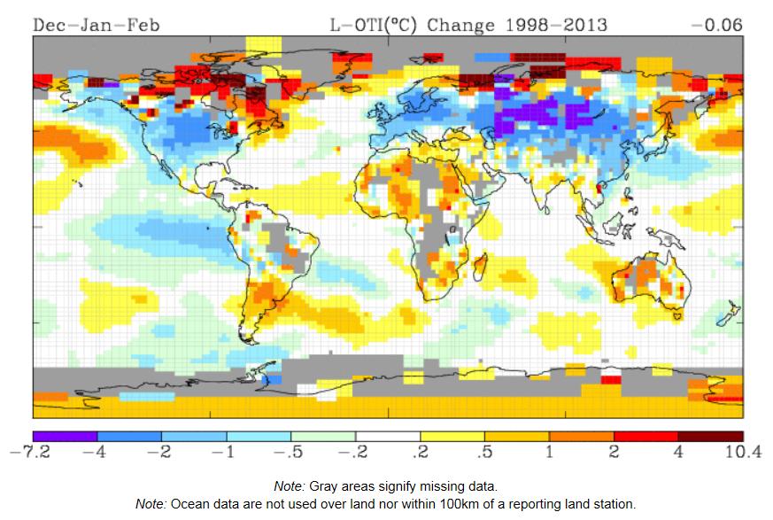
The temperature trend during the winter months (Dec, Jan and Feb) has shown basically no warming (actually 0.06°C cooling) from 1998 to 2013.

The annual temperature trend has also shown basically no warming (0.09°C warming) from 1998-2012.
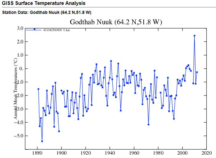
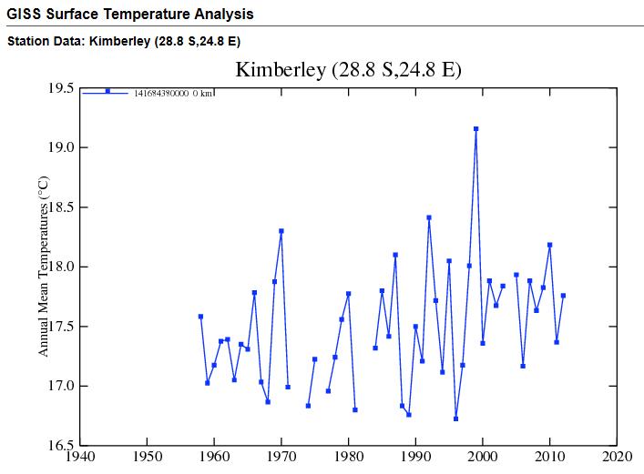
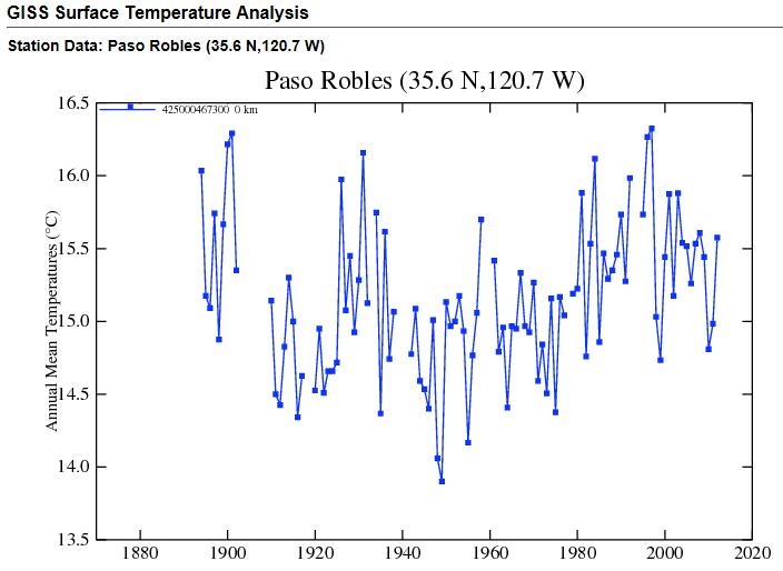
Let’s look at some individual temperature data from locations around the world. See if you can spot the temperature rises that the AGW cult has been reporting.


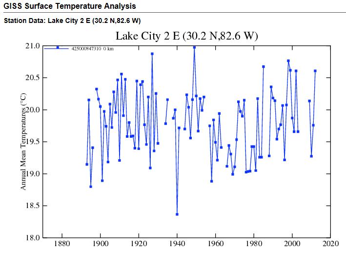


Oh, wait. This temperature chart does show a steady increase in temperatures at the Phoenix airport. Now here is something curious, a station that is only 21 miles from the airport shows a very different temperature trend.
Ft. Valley, Arizona (21 miles from Phoenix, Arizona).

The last two graphs highlight the difference between temperature stations located in a populated/urban area vs. a rural area. Temperature stations at airports will have buildings and concrete pavement to trap the heat and show temperature increases as the population/construction increases.
So there you have it. Another temperature data set showing no warming for 15 years and when you look at the individual temperature stations, you quickly come to the realization that the warming we saw prior to 1998 is not that all “unprecedented” as the AGW cult would like you to believe.

Worth reading is the Dr. David Whitehouse “Standstill” report, linked here:
Click to access Whitehouse-GT_Standstill.pdf
Also I will not use the HadCRUT 4, as it it has a built in warming bias, courtesy of over 100 Arctic zone stations added with no equivalent Antarctic supplements. Send a note of you want details!
Outstanding link and thanks for sharing, I had not read that report before.
I also use HADCRUT3 and not 4 in graphs you’ll see on this blog.
I hope the Nenet people in Siberia know that there is no warming trend. Their way of life is changing due to winter frost setting in later. See
http://www.guardian.co.uk/environment/2009/oct/20/arctic-tundra
Likewise, Inuit in North America are forced to change migration routes and their way of hunting, according to other reports.
According to comments in this blog, this trend should be balanced by areas in the southern hemisphere cooling down. There is a lot of talk about ice fields in Antarctica becoming smaller, huge ice floes braking off and floating away. I have no hard data on that, only what I see in the news. Are these reports falsified or overblown? There were even reports that a few years ago, the Swiss started packing their glaciers in aluminum foil. Did they do this for sheer fun or out of panic fueled by leftist propaganda? How do we consolidate observations and conclusions that are seemingly not reconcilable? It all sounds like a giant conspiracy, but in a way that sounds too easy
Actually, ICESAT laser measurement shows net ice growth in Antarctica.
However, net ice growth in the South is not offsetting the loss of ice in the North which I’ve read is five times faster than net accumulation in the South.
One argument from the weather change crowd is that the Ocean temperature in Antarctica is actually higher than normal putting more humidity in the air and wind is driving more snow. (Not their words but my understanding would be something like the “lake effect” in Chicalgo and Buffalo.)
Also, ice in Antartica is over land and there is only ocean under the Arctic so the argument goes that warming seas would cause more ice loss in the North than the South.
I am not qualified to make any judgements as to the accuracy of claims from either side. I’m only trying to summarize one possible theory that seems on the surface reasonable to me to explain why the North would be losing ice while the South has a net gain.
The link that provides the full text of the Abstract below has been taken down while
NASA reviews if it violates export standards. (Fuel for conspiracy theorists)
“Mass Gains of the Antarctic Ice Sheet Exceed Losses”
Zwally, H. Jay; Li, Jun; Robbins, John; Saba, Jack L.; Yi, Donghui; Brenner, Anita; Bromwich, David
Abstract:
During 2003 to 2008, the mass gain of the Antarctic ice sheet from snow accumulation exceeded the mass loss from ice discharge by 49 Gt/yr (2.5% of input), as derived from ICESat laser measurements of elevation change. The net gain (86 Gt/yr) over the West Antarctic (WA) and East Antarctic ice sheets (WA and EA) is essentially unchanged from revised results for 1992 to 2001 from ERS radar altimetry.
Imbalances in individual drainage systems (DS) are large (-68% to +103% of input), as are temporal changes (-39% to +44%). The recent 90 Gt/yr loss from three DS (Pine Island, Thwaites-Smith, and Marie-Bryd Coast) of WA exceeds the earlier 61 Gt/yr loss, consistent with reports of accelerating ice flow and dynamic thinning. Similarly, the recent 24 Gt/yr loss from three DS in the Antarctic Peninsula (AP) is consistent with glacier accelerations following breakup of the Larsen B and other ice shelves. In contrast, net increases in the five other DS of WA and AP and three of the 16 DS in East Antarctica (EA) exceed the increased losses.
Alternate interpretations of the mass changes driven by accumulation variations are given using results from atmospheric-model re-analysis and a parameterization based on 5% change in accumulation per degree of observed surface temperature change. A slow increase in snowfall with climate warming, consistent with model predictions, may be offsetting increased dynamic losses.
(PDF Link to full text has been taken down by NASA:)
Click to access 20120013495_2012013235.pdf
You will, at some point, be attacked for using a vastly limited time frame as the basis for your conclusions. This chart may help with covering a much longer period of cyclical temperature extrapolated from eras preceding the arrival of man and those following man’s “infection” on the global environment.
Nice article. Thanks for posting.
Yes, I like that chart and have book marked it! Thanks for sharing!
That chart along with the Vostok Ice Core Data (which can be found in the last link in this blog post “unprecedented”) are good charts showing the long term variability of Earth’s climate long before we started driving SUV’s.
You are most welcome. Thank you for sharing your passion and knowledge online.
Pingback: Climate vs. Weather | cosmoscon
Pingback: AGW Lies On Antarctic Ice | cosmoscon