
The AGW Cult corruption is easily proven as they tamper with past temperature data. In a saner world, these guys would be in jail.
In 1975, the National Academy of Sciences published the graph below – showing that the 1930s were very hot in the northern hemisphere, and that there had been a sharp cooling trend since 1940.
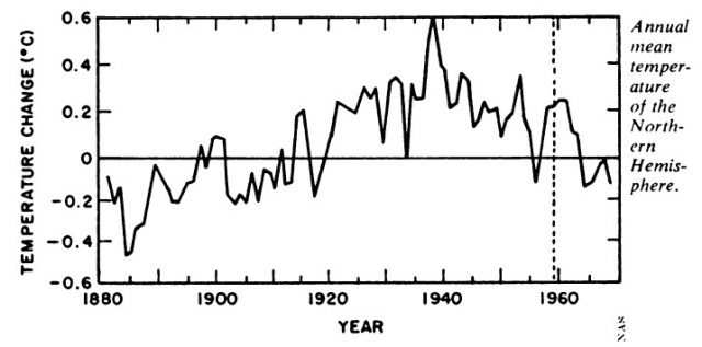
Neither of these facts fit Hansen’s theory, so he largely got rid of both.
Data.GISS: GISS Surface Temperature Analysis: Analysis Graphs and Plots

GISS has a link on their web page to the data.
Annual and five-year running mean temperature changes with the base period 1951-1980 for the northern (red) and southern (blue) hemispheres.
available is a table
Data.GISS: GISS Surface Temperature Analysis: Analysis Graphs and Plots
Their public data link is of course forbidden, in the spirit of transparency.

Fortunately I was able to find a link in the Internet archive from 2010.
The graph below plots Hansen’s Northern Hemisphere five year running mean from that data set…
View original post 137 more words

We also know that the situation is far worse than indicated by recent data and models (which are reviewed in the following paragraphs). We’ve known for more than a decade what happens when the planes stop flying: Because particulates were removed when airplanes were grounded, Earth warmed by more than 1 C in the three days following 11 September 2001 . In other words, Earth’s temperature is already about 2 C higher than the industrial-revolution baseline. And because of positive feedbacks, 2 C leads directly and rapidly to 6 C, acidification-induced death of the world’s oceans, and the near-term demise of Homo sapiens. We can’t live without life-filled oceans, home to the tiny organisms that generate half the planet’s oxygen while comprising the base of the global food chain (contrary to the common belief that Wal-Mart forms the base of the food chain). So much for the wisdom of the self-proclaimed wise ape.