One of the Left’s favorite memes is telling people that everyone should pay their fair share of taxes. Of course they can never define what a ‘fair share’ is and it’s no accident we never see people like Elizabeth Warren tell us exactly what she means by this term. If they told us what their real definition was it would frighten people because they basically want more tax revenue until there are no more wealthy people and we are all poor and dependent on the Government.
Instead of making everyone poor, I am a Conservative and I prefer to increase everyone’s wealth by following Free Market principles. Since I’m not afraid to tell people what I feel is a ‘fair share’, let me attempt to define that term and prove that the wealthiest 50% of Americans are actually paying MORE than their ‘fair share.’
There are two measurements that I’ll use to formulate my ‘fair share’ definition – Adjusted Gross Income (AGI) share percentage and Total Income Tax share percentage. These terms are reported annually by the IRS and are broken down by income demographics (Top 1%, 5%, 10%, 25% and 50%). The IRS reports how much of the total US AGI is accounted for in each income demographic and how much each income demographic pays as a percent of overall income tax for that year.
So my definition of a ‘fair share’ is this – Each income demographic group should pay a percentage of total income tax that is equivalent to their corresponding AGI percentage. In other words – If you are in an income demographic group that accounts for 20% of all income in the US then your total group should account for 20% of all income taxes collected.
Sounds fair, right? Your percent of the income tax is equal to your share of the income.
Side Note – This definition is not the same as a Fair Tax system and while I’m a big proponent of this, we don’t have that now so I’m attempting a definition of ‘fair share’ that works with our existing progressive income tax structure.
Ok, now let’s dig into the data and see how close we come to my ‘fair share’ definition. And in an interest to fully disclose my data source – I use the IRS website to obtain the particular spreadsheet that I need to generate the graphs you’ll see below. Tax year 2010 is the latest data the IRS has published so that is what I’ll be using here. I did a similar analysis with 2009 tax data and you can go here if you are interested.
Here is a graph showing how the various income demographic groups are divided in 2010 based on the minimum annual income (in 2010 dollars).

Now let’s look at the percent of AGI for the top 3 income demographics over the past 10 years and you can see that the top 1% accounted for roughly 20% of the total AGI, the top 5% accounted for around 35% and the top 10% accounted for around 45%.

If my definition of ‘fair share’ is correct then the amount of total income tax by these three income demographic groups should be about equal to their AGI percentages (20% for the top 1%, 35% for the top 5% and 45% for the top 10%).
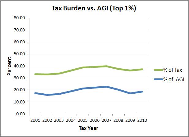


Wait a minute! These income demographic groups are paying almost twice their percentage of tax revenue when compared to their AGI revenue. How can Leftists say they aren’t paying their fair share? The IRS data show that they are paying much more than their fair share!
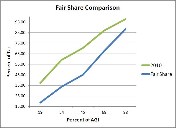
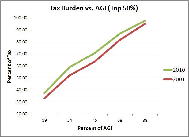
To show it another way, I’ve graphed the AGI percentages vs. Tax percentages of the top 50% for 2010 and compared that with what the graph should look like if we used my definition of ‘fair share’ (Tax percentage equals AGI percentage).
When you look at a graph over the past 10 years (comparing 2001 with 2010) comparing AGI share with Tax share, you see that we are moving in a direction of more unfairness (each income demographic is paying a bigger share of the Tax revenue that doesn’t match their AGI share).
It looks even worse when you look at each group and compare how much their AGI share increased versus their Tax share increased from 2001 to 2010.

The top 1% saw their AGI share increase by just over 1.5 percentage point from 2001 to 2010 but their share of the Tax revenue increased by over 4 percentage points! Doesn’t it seem ‘fair’ that when your share of the total more income increases by X percentage points that your share of the income taxes shouldn’t increase by more than X percentage points? Apparently not for Leftists!
There is no way you can honestly look at this data and tell the American people that the wealthy aren’t paying their fair share. Any attempt to do so reveals that you are either ignorant of the data or have a more insidious purpose. Or both.